Ad verification
On this page
Advertisers spend a lot of money to place display ads. In return, they want one thing: confidence the ads actually ran on the publishers they paid for. Until this project, Similarweb couldn't give them that directly.
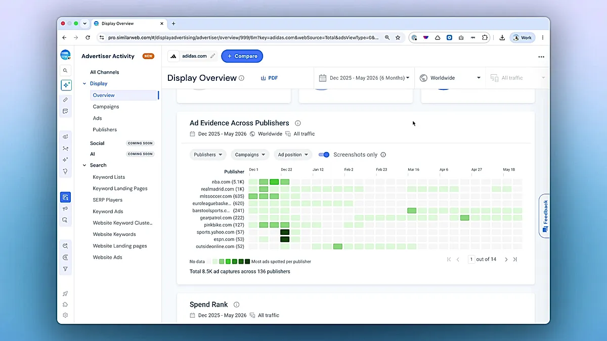
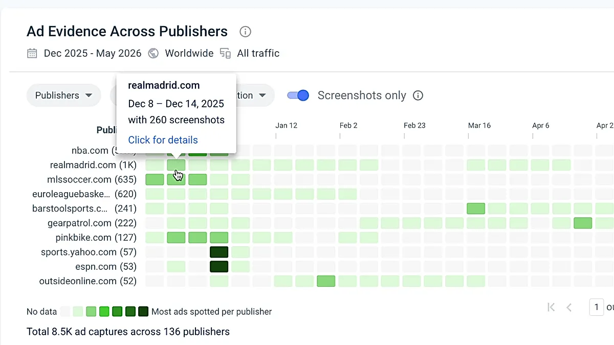
Ad verification widget answers that question on the Display Overview page in Ad Intelligence. You pick an advertiser, you see a heatmap of publishers by day, and you click into any cell to see the screenshots we captured. It's now part of the Display Overview surface every Ad Intelligence user lands on.
The problem #
Advertisers were paying for placements with no first-party way to prove the ad landed. Customer success kept routing the same question back to the product: "Can you show me proof my campaign ran on these publishers?" Before Ad verification, the only path was opening one ad record at a time and reading metadata. You couldn't see a publisher across time, compare publishers side by side, or filter for the moments we actually captured a screenshot.
This extended Ad Intelligence rather than starting something new. We already had the underlying data, we just had to built a surface that answered the verification question directly.
My role #
I led design end-to-end: research, information architecture, visual, interaction. Matej T. was PM and the main acceptance voice. Rafael, Matej M. and Alex implemented the widget. We worked in tight loops on every component.
Prerequisites from research #
Screenshots are the proof. Everything else is metadata.
Counts, positions, durations, campaign names are useful, but they aren't what an advertiser opens the page to see. They open it to look at the actual creative we captured running on the actual publisher. That belief decided the most important defaults in the widget: the screenshots-only toggle is on by default, and the drawer opens to a screenshot grid instead of a metadata table. The heatmap also colors each cell by the ratio of screenshots to events, not the raw count.
The design and implementation #
The hardest design decision was how to let users drill down without losing the overview.
Verification is a "find the anomaly" task. A user wants to scan many publishers across many days, spot the row that looks different, and investigate. If clicking a cell takes them to a new page, they lose the comparison. If the detail view is too small, they can't see the screenshots properly. I landed on a side drawer that opens over the widget but keeps the heatmap visible behind it. A layered image preview opens on top of the drawer, and closing the preview keeps the drawer open. The drawer does the work and the heatmap stays visible as the way back to it.
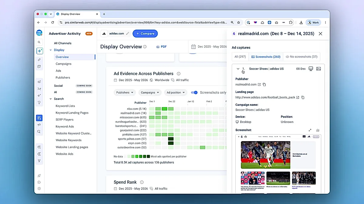
The drawer's summary control was the other consequential decision. The first version had a static summary card with three numbers: total events, screenshots, no-screenshots. Acceptance feedback was that users couldn't act on a summary; they wanted to filter. The card became a segmented control with the same three categories, and the counts moved inline as part of each segment. The data didn't change, but its job did — the summary is now the filter, not a readout of one.
The messy middle #
This widget shipped after three significant shifts. Each one was the right call. None of them were planned.
The first was the backend contract. Mid-project the backend team simplified the filter-options response and the publisher / campaign options shape changed. We rewrote the filter hooks to match. Designing against the original contract had been hypothetical, designing against the new one was real.
The second was the summary card to segmented control swap. The visual change was small. The IA change was bigger: filtering became the main action in the drawer, not a secondary option.
The third was a long tail of acceptance feedback from Matej on the heatmap itself. Cell coloring strategy. Publisher count abbreviations. The "no data before May 2025" notice. Legend placement relative to the total summary. None of these are visible in a single before/after, but together they're the difference between a widget that looks finished and one that is.
The craft #
The heatmap color logic is the thing most users won't notice and that took the most work.
Three problems compound when you visualize sparse, long-tail data like screenshot capture counts:
-
A few publishers have 100x more events than most others. Linear scaling hides everything except the loudest rows.
-
Every publisher's "busy" looks different. A publisher with 5 screenshots and one with 5,000 both have a peak day worth seeing.
-
When the screenshots-only toggle is on, the meaningful signal is the ratio of screenshots to total events, not the screenshot count.
The implementation handles all three. Color scaling is logarithmic, so long-tail rows still show their internal variation. The scale is per-row, so each publisher's heatmap is normalized to its own range and you can read patterns regardless of total volume. And when screenshots-only is on, the color reflects the screenshots-to-events ratio for that cell, not the raw count.
const buckets = colors.length - 1;
const lnMin = Math.log(posMin);
const lnMax = Math.log(max);
const step = (lnMax - lnMin) / buckets;
const thresholds = Array.from(
  { length: buckets },
  (_, i) => Math.exp(lnMin + step * (i + 1))
);
What I’d do differently #
Pull in backend and data earlier. Designing against an idealized response shape instead of a real one cost me design cycles when the backend contract changed.
How I worked #
I first started in Figma to note down my research and to explore the dataviz approaches. Then I mocked the prototype, especially so that I could see how various periods are covered using v0 from Vercel.
Handing it over to Rafael, we discussed performance of the widget, tooltips and all the edge cases.
Impact #
The widget shipped with full analytics tracking: filter changes, the screenshots-only toggle, cell clicks into the drawer, and domain selection in compare mode are all tracked.
The whole point of the screenshots-only default was to bet that most users want proof first and data second. The toggle behavior chart is the honest test of whether that bet was right.
I cannot disclose these numbers so I’d keep them here just as placeholders.
Credits #
Matěj Tremko (Product Manager)
Rafael Kamaltinov (Fullstack Engineer)
Matěj Müller (Backend Engineer)
Alex Shcherbakov (Fullstack Engineer)
Yulia Fomicheva (QA Engineer)
- Previous: Onboarding for Merchants