Satisfaction survey
Context #
When I joined Apify, the company already had a solid user base but did not have a way of collecting insights and feedback from the users yet. A continuous research in a form of calls sounded too time-consuming back then so we decided to set up an automated survey.
The survey #
I created the survey using Typeform. I sat down with relevant stakeholders and collected ideas on things we could collect.
These are the questions that made it to the survey:
-
How did they learn about Apify?
-
On a scale 0-10, how would they recommend Apify?
-
What services could Apify integrate with?
-
What could Apify improve?
Data setup #
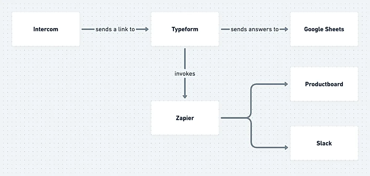
The link to the survey was being sent via Intercom series – there was a set of rules and logic that determined when and how the link was being sent to the user. To make sure the users would be willing to fill out the survey, Apify gave them usage credits worth $10 in return. Once they filled it out, the data were sent to Google Sheets, Productboard and Slack for other company folks to take a peek.
Analysis #
Cleansing #
Once in a while, I would go through the Google Sheet and perform regular clean ups. I would read the user feedback and label it with a category label (standing for an area for improvement). Some feedbacks that would tap into multiple categories at once. If the category was new and relevant, I just created a new category label or just used the Other label for less relevant area.
The data visualization #
Once I collected enough data, I decided to code an interactive data visualization that would help me with answering few hypotheses.
I placed each survey fill on a timeline and used a circle representation.
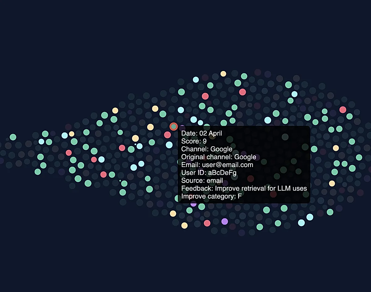
Size of the circle – Rating on a scale 0-10
Color of the circle – Acquisition channel
Position of the circle on the x axis – Date of submission
Hovering the respective circle would display a tooltip with the details.
On the right side to the timeline, I created groups of checkboxes with:
-
Categories of areas of improvement for filtering
-
Acquisition channels
By interacting with the individual checkbox a related circle would either have full opacity or low opacity, highlighting the filtered data at first glance.
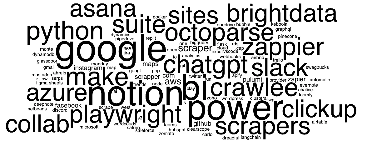
Wordcloud #
To see the users’ suggestions on services that Apify could integrate with, a wordcloud seemed as the first solution that came up to my mind. However, the original CSV is messy with typos so I used ChatGPT for that.
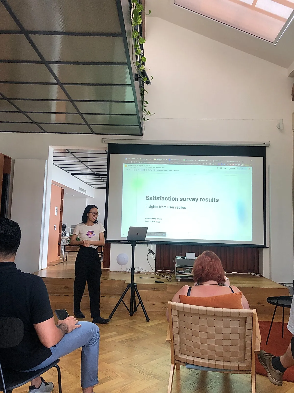
Presenting the insights #
Once I had the insights from the analysis (dataviz and wordcloud), I organized a so-called Eat&Learn session so that I could be share my insights with the relevant stakeholders (mainly product teams and C-level).
Personal reflection and evaluation #
Well, this certainly was a challenge. There were some tiny puzzles along the way such as:
-
Configuring the hidden fields so that the user credentials are passed to the form
-
Manually giving the users free credits until the internal coupons system was created → so I decided to automate that
Also, there’s always a room for improvement. I would now:
-
Retrieve the categories as the areas of improvement using an AI tool instead of manual bucketing
-
Map each user with a subscription plan they’re on
-
If the user feedback was included and implemented, send a notification/message to affected user
- Previous: Onboarding for Merchants